I recently had the pleasure of viewing a video of a PowerPoint presentation that surprised me with its fresh approach.
Slides were new. Case examples were recent and relevant. Graphics were entertaining and supported the theme. Photos were used in historical context. Information flowed cohesively. The audience was totally engaged. The presentation received rave reviews—no small feat for a late Friday afternoon session.
What made the slide show click? Take a look at the following PowerPoint tips gleaned from online resources Lifehack.org and GarrReynolds.com, which the presenter followed.
- Write a script
This need not be a full script but at least an outline, some kind of plan. The judge had some ideas in mind and pulled together extensive notes. He conducted research by talking to fellow judges and staff in his courthouse. A conference call with the local jurisdiction (where he was presenting) gave him additional insights into the culture and history of the court. - Have a visual theme, but avoid using PowerPoint templates
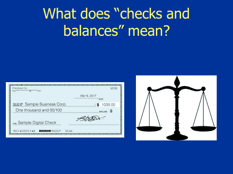
To display a literal visual of the theme, the slide displayed a check for $1,000 next to the scales of justice:

- Have a hook
The judge reeled the audience in with this opening “Justice League” slide, which told the audience this wasn’t going to be your ordinary PowerPoint presentation. It lightened the mood for a Friday afternoon, immediately grabbing their attention.

- Spend time in Slide Sorter
GarrReynolds.com suggests you get out of Slide View and into the Slide Sorter view. That way you can see the flow of your presentation. The judge said he went through the Slide Sorter at least six times before finalizing his presentation. - Think outside the screen
Good PowerPoint slides are key to any successful presentation. But don’t take other considerations for granted. Before the presentation the judge and the clerk of the court were discussing the presenter’s wardrobe. Originally the judge planned on wearing a suit and tie, but they mutually agreed that he would feel more comfortable if he dressed casually in jeans since the staffers would be dressed casually.
As a judicial education manager, I have the opportunity to review PowerPoints before course materials are finalized for the class binder. In this case I had the opportunity to see the slides just before the judge arrived in court, where he finalized the presentation with the clerk of the court. His presentation also followed these tips:
- Keep it simple
- Use your fonts well
- Limit bullet points and text
- Pay attention to design
- Use images sparingly
- Limit transitions and animations
- Modulate, modulate, modulate
As the new year approaches, consider taking a revitalized look at your current PowerPoint presentation(s). What can you do to enhance the look of the presentation? What video clips need to be updated? Are learning objectives being followed? Will participants leave with some thoughtful takeaways? Have you reviewed additional PowerPoint resources through the NJC, such as NJC PowerPoint templates and instructions, and the NJC Style & Proofing Guide, Faculty Handbook & Instructional Manual, and Faculty Role & Responsibilities?
The judge who presented “Separation of Powers” took the time to research the local statutes, took photos of the local courthouse, and concluded the presentation by making it about the audience. He displayed a slide that affirmed that “EVERY MEMBER of the judicial branch plays an important role in the ‘due administration of justice.’”
He displayed a list of 10 staff roles. As he read them, he made each a tribute to the person in the role. Everyone felt recognized, and they understood the importance of their role in the “Separation of Powers.” It was a motivating moment.
We thank NJC faculty member Judge Thomas A. Zonay, presiding judge of the superior court of Rutland County, Vermont, who presented “Separation of Powers” to 100 staff members of the Judicial District Court in Reno on a Friday afternoon, October 20, 2017. Jackie Bryant, Esq., court administrator/clerk of the court, remarked:
“Judge Zonay was fabulous! His presentation far exceeded my expectations. Thank you so very much for facilitating the training. I really cannot express how grateful I am.”
Breathe life into your PowerPoints. Remember your audience. Connect with them through your voice, verbiage and visuals. Leave them inspired. Reimagine your presentation(s) for your next class in the New Year.
References:
Garr Reynolds. Top Ten Slide Tips. Accessed November 30, 2017, at http://www.garrreynolds.com/preso-tips/design/
10 Tips for More Effective PowerPoint Presentations. Accessed November 30, 2017, at https://www.lifehack.org/articles/featured/10-tips-for-more-effective-powerpoint-presentations.html

The National Judicial College has awarded Missouri Supreme Court Judge Mary Russell with the Sandra Day O�...

Emeritus Trustee Bill Neukom (left) with former Board of Trustee Chair Edward Blumberg (right) at the NJC 60...

The National Judicial College, the nation’s premier institution for judicial education, announced today t...

The National Judicial College (NJC) is mourning the loss of one of its most prestigious alumni, retired Uni...

As threats to judicial independence intensify across the country, the National Judicial College (NJC) today...